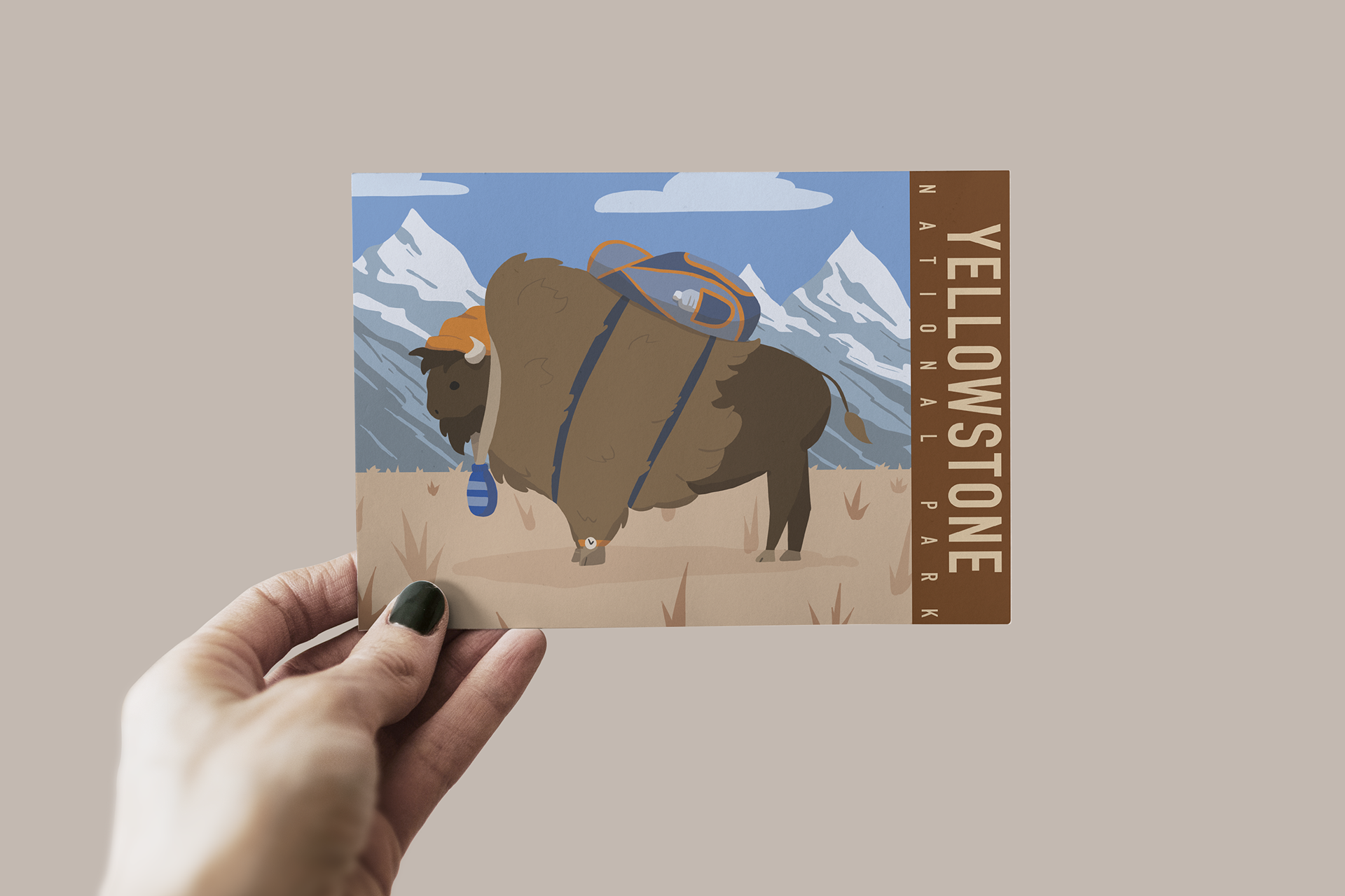
I've also included the original file to show the colors as they are meant to be.
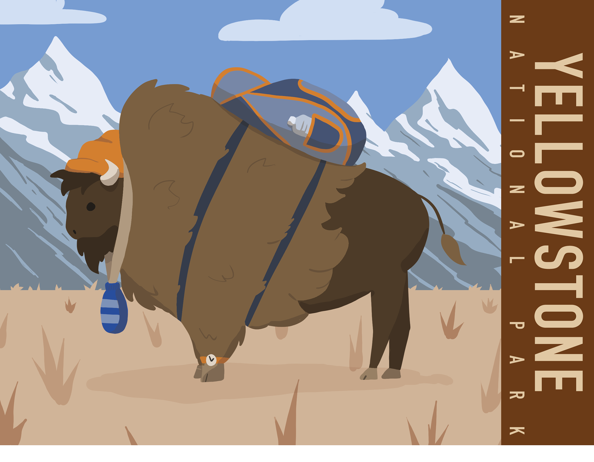
I illustrated and designed a postcard for a selected travel destination using a pair of complimentary colors and their chromatic grays. I went with Yellowstone because I had the idea for backpacking bisons, thought the comedic effect would be a good selling point.